

  |

| lastguru |
 Feb 5 2006, 19:45 Feb 5 2006, 19:45
Post
#1
|
 The one who knows  Group: Jounin Posts: 1174 Joined: 23-May 05 From: Kaigan (Riga, LV) |
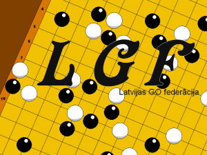
kaads buutu Latvijas GO Federaacijas logo, un kaa izskatiitos izsniedzamie goda raksti (papiiriishi par 1., 2., 3. vietu, un kkas tadaa garaa).
tikai luudzu normaalaa izmeeraa un atveertaa formaataa... labaak no saakuma par programaam, izmeeriem un failu formaatiem pajautaat nekaa peec tam zaudeet laiku, meegjinot sakonverteet (un ne vienmeer izdosies, un tad naaxies paarziimeet) logo ja nevar nekaadiigi vektorgrafikaa (es atbalstu PostScript, PDF un SVG failus), tad kaadi 600x600 vismaz (rastra grafikas formaatus saprotu laikam visus, ieskaitot BMP, PNG, GIF, TIFF, JPEG; PhotoShopa .psd formaats neskaitaas - to nevajag), un jo vairaak, jo labaak. bet tomeer luudzu pacensties vektorgrafikaa. Godarakstus modificeejamaa formaataa, veelams OpenOffice (un ja tiek izmantoti kaut kaadi nestandarta fonti, tad luudzu kopaa ar fontiem). klaat pie taa, bildiiti kur buutu paraadiits kaa tas izskataas uz juusu kompja lai nebuutu paarpratumi dazhaadu iemeslu deelj (visticamaak fonti, vai arii ja dokuments tiks izstraadaats ieksh Microsoft Office (veelams izvairiitis no godarakstu veidoshanas microsoft offisaa - dabuujiet sev pa briivu OpenOffice no www.openoffice.org) tad visaadi konvertaacijas bugi var buut). Corel, illistrator, pagemaker un liidziigus failus neatbalstu (visticamaak, ar gruutiibaam un kropljojumiem tomer vareeshu nolasiit, bet nevareeshu modificeet, kas liidz ar ko neder, jo godarakstos vajadzees likt iekshaa infu, vai piemeeram federaacijas priekshseedeetaaja vaardu mainiit). -------------------- Choice is an illusion created between those with power and those without. - The Merovingian
The Tao of posting: Don't argue with idiots - they will drag you to their level and beat you with experience. And never underestimate the power of stupid people in large groups... |
   |

 
|
| Aven |
Feb 5 2006, 21:36
Post
#2
|
 Kaigan īpašums Group: weirdo Posts: -170 Joined: 21-November 05 From: Rīga => Vecmīlgrāvis |
 http://otaku.lv/uploads/20060206_896_LGFlogoB&W.PNG This post has been edited by Aven: Feb 6 2006, 17:20 --------------------  |
|
|
|
| Tigra2 |
Feb 5 2006, 22:21
Post
#3
|
 kawaii tora Group: Chuunin Posts: 2359 Joined: 19-August 05 |
 -------------------- |
|
|
|
| deleted-ray |
Feb 5 2006, 22:28
Post
#4
|
 Heimin Group: Chuunin Posts: 0 Joined: 14-June 04 |
Es tikai varu pasviest ideju, ka fonā logo derētu kāda daļa dēļa, kur būtu kāda interesanta situācija attēlota, nevis random akmeņi salikti.
|
|
|
|
| lastguru |
Feb 5 2006, 22:28
Post
#5
|
|
The one who knows Group: Jounin Posts: 1174 Joined: 23-May 05 From: Kaigan (Riga, LV) |
miiljie cilveecinji, vajag kko ko nav kauns ielikt gan uz ziimoga, gan uz viziitkarteem, gan uz bukletinjiem. kaut kas vienkaarshs... jo vienkaarshaak, jo labaak
-------------------- Choice is an illusion created between those with power and those without. - The Merovingian
The Tao of posting: Don't argue with idiots - they will drag you to their level and beat you with experience. And never underestimate the power of stupid people in large groups... |
|
|
|
| Ha-san |
Feb 6 2006, 15:31
Post
#6
|
|
Yumemiru hito Group: Chuunin Posts: 4 Joined: 30-September 04 From: Kampai-Riga |
  |
|
|
|
| Sigfa |
Feb 6 2006, 16:40
Post
#7
|
 Kami-sama Group: ALK Posts: 2738 Joined: 17-May 04 From: Starp pudelēm un četrām sienām |
domaaju, ka 10kb svars runaa pats par sevi. Protams, vektori. Shis taakaa buutu logo, ziimogam to lietu var vienkaarshi simplificeet.
Kaa vienmeer, otaku nenjem pretii transperency, tapeec pievienoju kaa attachment. Attached thumbnail(s) 
|
|
|
|
| lastguru |
Feb 6 2006, 17:03
Post
#8
|
|
The one who knows Group: Jounin Posts: 1174 Joined: 23-May 05 From: Kaigan (Riga, LV) |
ja godiigi, tad neviens variants nekriit aciis pagaidaam.... var veerteet, kaadam ir labaaks, kaadam ir sliktaaks, bet neesmu vel redzeejis ko taadu, ko uzreiz gribaas panjemt. pameegjiniet izteeloties kaa shis izskatiisies uzdrukaats:
1. uz nekvalitatiivaa melnbaltaa printera 1cm uz 1cm, vai tad varees kaut ko ieraudziit? 2. vienaa kraasaa (bez peleekaas - tikai viena kraasa, piemeeram, melnaa, uz kaada fona, piemeeram, baltaa) 2.5cm reiz 2.5cm, vai tad paliks visa maakslinieciskaa veertiiba? 3. kraasaini uz plakaada 3 metri uz 3 metri, vai cilveeks staavot tuvumaa nepazudiis dekoraacijaas? -------------------- Choice is an illusion created between those with power and those without. - The Merovingian
The Tao of posting: Don't argue with idiots - they will drag you to their level and beat you with experience. And never underestimate the power of stupid people in large groups... |
|
|
|
| Sigfa |
Feb 6 2006, 17:10
Post
#9
|
|
Kami-sama Group: ALK Posts: 2738 Joined: 17-May 04 From: Starp pudelēm un četrām sienām |
atceries, ka visur nav jaaizmanto viens logo, var varieet. Tas manis taisiitais bija domaats webam un kvalitatiivaam laazerprintera izdrukaam.
Jautaajums ir vai koncepcija patiik. Taalaak jau elaboreeties. |
|
|
|
| Tigra2 |
Feb 6 2006, 17:30
Post
#10
|
|
kawaii tora Group: Chuunin Posts: 2359 Joined: 19-August 05 |
  -------------------- |
|
|
|
| lastguru |
Feb 6 2006, 17:55
Post
#11
|
|
The one who knows Group: Jounin Posts: 1174 Joined: 23-May 05 From: Kaigan (Riga, LV) |
QUOTE(Sigfa @ Feb 6 2006, 16:10) atceries, ka visur nav jaaizmanto viens logo, var varieet. Tas manis taisiitais bija domaats webam un kvalitatiivaam laazerprintera izdrukaam. Jautaajums ir vai koncepcija patiik. Taalaak jau elaboreeties.  ir jaabuut vienotam stilam visur. koncepcija par vienu kaulinju pam patiik. avenam ir smuks ziimeejums, bet tur ir pa daudz kaulinju - tas noveersh uzmaniibu no galvenaa. tev savukaart, fonti ir paaraak nepamanaami un mazi manupraat. Ha-sana logo dizainnaa viss ir tradicionaali, bet tomeer paaraak vienkaarshi... vismaz fontwork vareetu kaut kaads buut, un kaut-kaads dizaina elements, kas paraadiitu ka mees esam GO federaacija, nevis burtu kombinaacija. P.S. esmu spameris, man shodien ir 900. posts  -------------------- Choice is an illusion created between those with power and those without. - The Merovingian
The Tao of posting: Don't argue with idiots - they will drag you to their level and beat you with experience. And never underestimate the power of stupid people in large groups... |
|
|
|
| Sigfa |
Feb 6 2006, 17:57
Post
#12
|
|
Kami-sama Group: ALK Posts: 2738 Joined: 17-May 04 From: Starp pudelēm un četrām sienām |
QUOTE(lastguru @ Feb 6 2006, 17:55) ir jaabuut vienotam stilam visur. koncepcija par vienu kaulinju pam patiik. avenam ir smuks ziimeejums, bet tur ir pa daudz kaulinju - tas noveersh uzmaniibu no galvenaa. tev savukaart, fonti ir paaraak nepamanaami un mazi manupraat. nu, nav iisti ko dariit, taakaa paspeeleeshos. Ja koncepcija ir ok, taalaakais jau ir vienkaarshi. UPDT: nu, reku arii rezultaati. PS. piekaast transparency Web quality: Stamp quality (ar divaam kraasaam tomeer nezheeliigi gruushi. Nezinu vai labaak ir ar vai bez taas liinijas. :  |
|
|
|
| lastguru |
Feb 6 2006, 18:56
Post
#13
|
|
The one who knows Group: Jounin Posts: 1174 Joined: 23-May 05 From: Kaigan (Riga, LV) |
stila vienotiibu nenoveeroju... runaajo par liiniju, laikam ir vajadziiga, tikai ne tur... pats nezinu kur...
 un fontu stilu gribaas kaut kaadu... -------------------- Choice is an illusion created between those with power and those without. - The Merovingian
The Tao of posting: Don't argue with idiots - they will drag you to their level and beat you with experience. And never underestimate the power of stupid people in large groups... |
|
|
|
| Sigfa |
Feb 6 2006, 19:34
Post
#14
|
|
Kami-sama Group: ALK Posts: 2738 Joined: 17-May 04 From: Starp pudelēm un četrām sienām |
meh, nu, pagaidiishu, kameer buus kaads labaaks variants, savaadaak nav paaraak lielas veelmes dziities shitaa :S
Man gan likaas ka ir pietiekoshi liela stila vienotiiba, bet kaa gribi. Ziimogs tomeer. |
|
|
|
| Ha-san |
Feb 7 2006, 11:40
Post
#15
|
|
Yumemiru hito Group: Chuunin Posts: 4 Joined: 30-September 04 From: Kampai-Riga |
Logo:
 Zimogs: Dokuments:  |
|
|
|
|
1 User(s) are reading this topic (1 Guests and 0 Anonymous Users)
0 Members:
| Lo-Fi Version | Time is now: 27 September 2024 - 09:57 |
Invision Power Board
v2.1.7 © 2024 IPS, Inc.